New Tool in eLearning@UNG (D2L)
The Course Overview widget on the instructor’s course homepage (left rail, directly below the Calendar widget) provides data about course access and student engagement.
Note: If you have created a separate custom homepage, the Course Overview widget will not be there by default. You will need to add it to your custom homepage or send an email request to deti@UNG.edu. Please indicate the CRN for the course(s) to which you would like it added.
About the Course Overview Widget
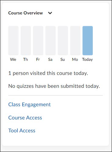
At the top of the widget, there is a graph representing the number of visits (by any user) during the past several days. Hover over a day to see the number of visits for that day.
Below the graph, there is text indicating the number of visits to the course today (if any) and the number of quiz submissions (if any) today.
To get more detailed information, the widget provides these three links:
- Class Engagement: Helps instructor to understand learner engagement and activity.
- Course Access: Helps instructor see how often learners are accessing a course.
- Tool Access: Helps instructor see details about D2L tools (e.g., assignments, quizzes, discussions, etc.) used in the course.
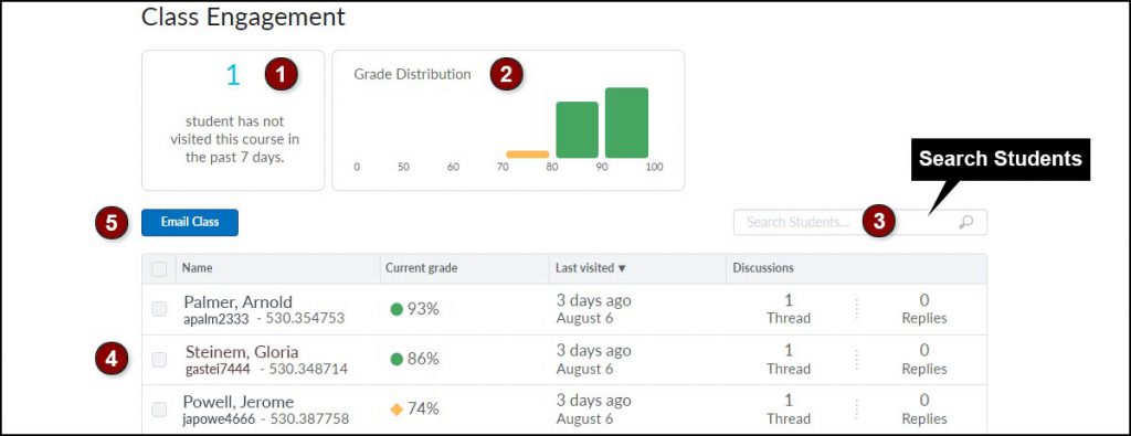
Class Engagement
This report provides details about individual students, and an overview of course visits, and grades.
The Class Engagement report contains:
- Not Visited: The number of students that have not visited the course during the past 7 days. Click the text to display student names and details.
- Course Distribution: Bar chart of students’ grade distribution in that course. If the D2L Gradebook treats ungraded items as zeroes, the distribution may be skewed to lower grades. Click a bar to filter learners in that grade group.
- Search Students: Locate the data for an individual student.
- Class List: Student Name, Current Grade, Last visited, Discussions threads and replies. This includes all discussion boards whether or not they are graded.
- Email Class: Click the checkbox next to the student(s) name and click Email Class button to send a message.
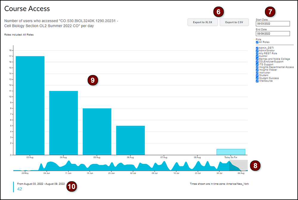
Course Access
The Course Access report provides graphs of the number of users who accessed the course homepage.
6. Export: Download the Course Access report using the XLSX (Microsoft Excel Open XML Spreadsheet) or CSV (comma-separated values) buttons.
7. Sort: Type a start and end date. Uncheck the “All Roles” checkbox (default) and check “Students” on the rolls list.
8. Date Range: The lower graph shows the available dates. The gray box shows the time frame of the start and end dates. Click and drag the box to adjust the range of dates or move the range of dates to a different week or month.
9. Bar Chart: The large bar chart provides an enlarged view of the number of users that accessed the course, the selected date range.
10. Access Events: The text below the chart/graph lists the number of “access events” for the time frame shown in the bar chart. An access event is a user accessing the course’s homepage.
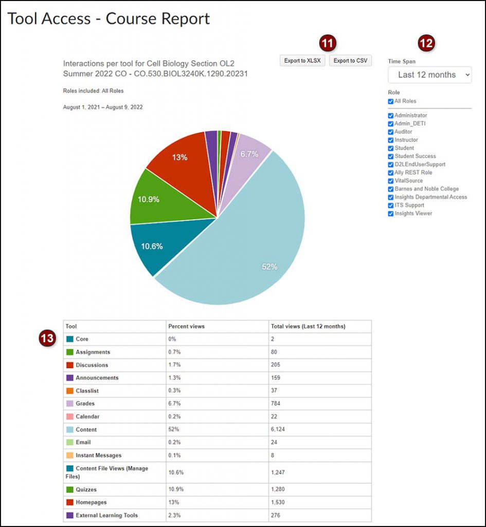
Tool Access Course Report
Displays a table and pie chart of the tools (e.g., assignments, discussions, classlist, quizzes, homepages, etc.) used in the course. Sort by a week, month or year.
11. Export: Download the Course Access report with the XLSX (Microsoft Excel Open XML Spreadsheet) or CSV (comma-separated values) buttons.
12. Time Span and Sort: Select Last 7 days, Last 30 days, or Last 12 months from the drop-down menu. Uncheck the “All Roles” checkbox (default) and check “Students” on the roles list.
13. Details: The table information shows both the percentages and the actual count of views of tools used. The pie chart is a visual representation of the tool data.
Resources
Read Introducing the D2L Course Overview Widget (PDF)
Learn about the two file types and when to use them: CSV vs XLSX (answers.microsoft.com)