Make D2L Content More Accessible
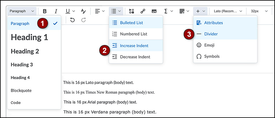
Properly formatted eLearning@UNG (D2L) content is easy to create with the D2L Brightspace Editor. Select the content and use the appropriate drop-down menu.
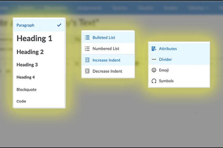
Headings Menu
Headings (also known as Heading tags or H tags) are used to logically organize content into sections. They make the webpage more attractive and easier to read.
Screen reader technology used by the visually impaired converts headings to navigation links. Without headings, the technology can only read the entire page – from top left to bottom right.
Note: Never use headings just to make text larger or smaller. Change the font size.
Headings 1 Through 4 Explained
Headings are used to divide content into sections and rank content in order of importance. The D2L Brightspace Editor includes these four headings:
- Heading 1 is the largest heading size and is usually reserved for the document title. It is rare to have more than one Heading 1.
- Heading 2 is the next largest size. It is used to indicate a major content section. There can be multiple Heading 2 sections on a page, but each Heading 2 should be unique.
- Heading 3 is a subset of Heading 2. There can be multiple Heading 3 headings under an Heading 2.
- Heading 4 is a subset of a Heading 3 and is the smallest heading size available in the D2L Brightspace Editor.
Note: Changing the font family, font size or color does not change the heading.
Paragraph Text
The general rule for website design is to use16px (12pt) paragraph text (also known as body text or “normal” text in other programs). When a new file is created in eLearning@UNG (D2L), the D2L Brightspace Editor opens the page with the Lato font at 16px as the default setting.
Can you change the font? Yes, but D2L’s recommended font is easy to read even on computer screens and mobile devices.
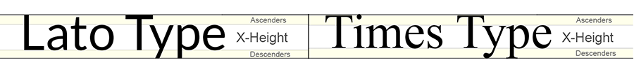
Why do some fonts look bigger than others when used at the same size?
A font is measured from the top of the tallest letters (such as t, d, f) to the bottom of the lowest letters (such as y, p, q). The height of a letter without an upper or lower portion (such as e, c, v) is known as the font’s x-height. So, Lato 16px and Times New Roman 16px are the same height on the webpage, but Lato has a larger x-height and so it looks bigger. The shape of the font and letter spacing also affect readability.
Lists and Indent Menu
Adding bullets or numbering items using the keyboard is not the same as making bulleted or numbered lists from the Brightspace Editor. The editor creates HTML code that works better with screen reader technology.
Always indent text or images using the indent menu. It’s okay to use multiple indents. Each increase or decrease is 40px (about 0.42 of an inch). Use the increase indent menu three times and the indent moves an item 120px from the margin.
A text-to-speech screen reader will speak each space when multiple spaces are used instead of indenting an item. Imagine hearing “space space space space space.” Use the indent menu.
Divider Line
A divider (also known as a horizontal rule) is used to separate content on a webpage with a line. The divider is found under the “other insert options button” (plus sign) on the upper level of the D2L Brightspace Editor next to the tables icon.
Don’t type underscores to create a line. Underscores are read out loud by screen readers.
Resources
Brightspace Editor Keyboard Navigation and Shortcuts (brightspace.com)
Microsoft Accessibility Checker (microsoft.com)
Using h1-h6 to identify headings (w3.org)